


Most digital products are designed for people in optimal mental states. However, designing for Marie Curie meant creating an experience for the terminally ill and their loved ones and non-professional carers, who are likely in extreme emotional distress, cognitively overwhelmed, and physically exhausted.
I was brought on to transform Marie Curie's website into a genuinely helpful tool for supporting their audiences through an impossibly difficult time. The challenge was to provide that critical support without adding to cognitive load and emotional burden, both through information provided and brand application.
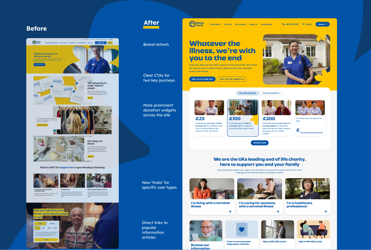
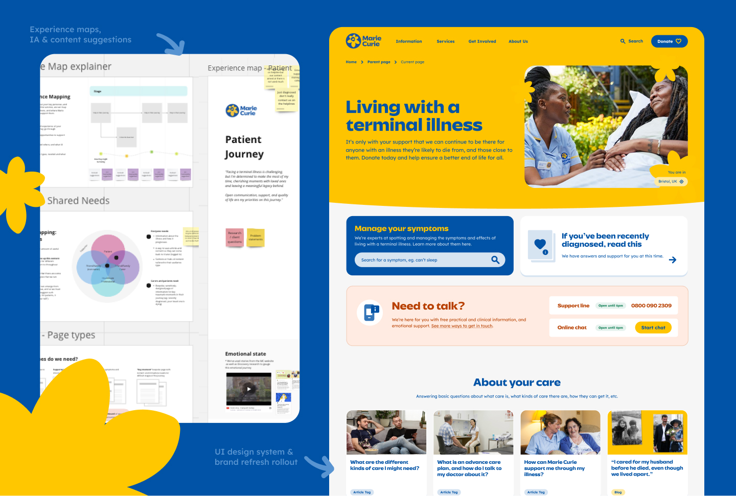
The website has now transformed Marie Curie's digital presence from a standard charity website into a functional tool for care, giving terminally ill patients and others the information and tools they need in a more accessible and effective way. It also gave the organisation a more sustainable and organised platform to publish their content and greatly improved the way they can promote fundraising events and ask for donations.
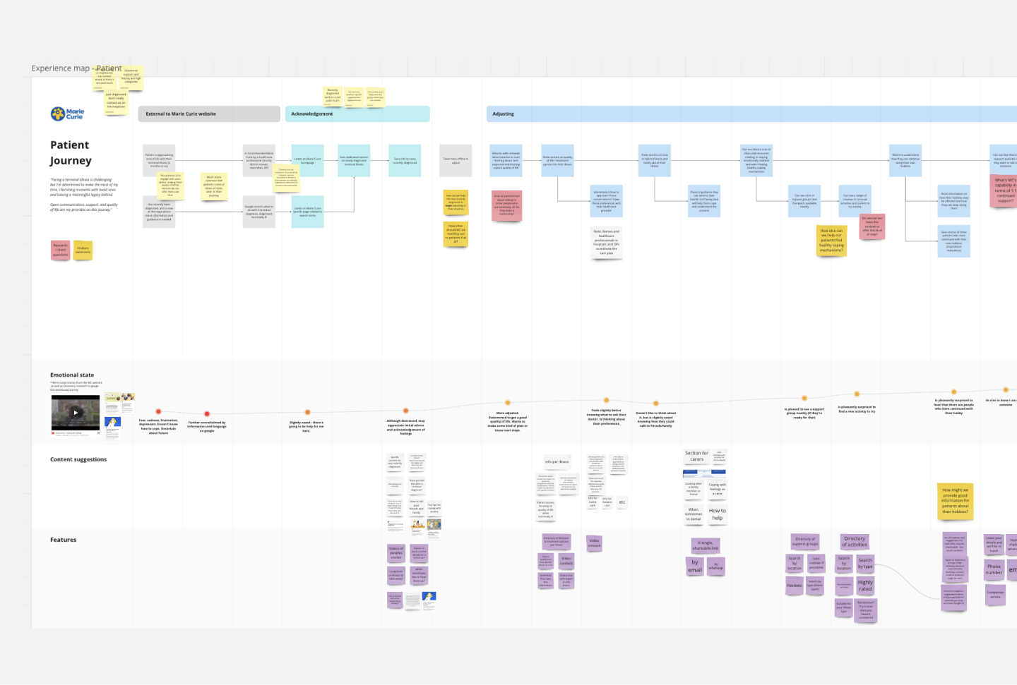
The team at Marie Curie came to us with some existing research into their key audience types, as well as articles, interviews about the experiences of the terminally ill and their non-professional carers, what they go through, how they feel, and what they need.
I dove into this research to map the experiences of each audience type This allowed me to truly empathise with their cognitive state at various stages, and identify opportunities for further support or new tools.
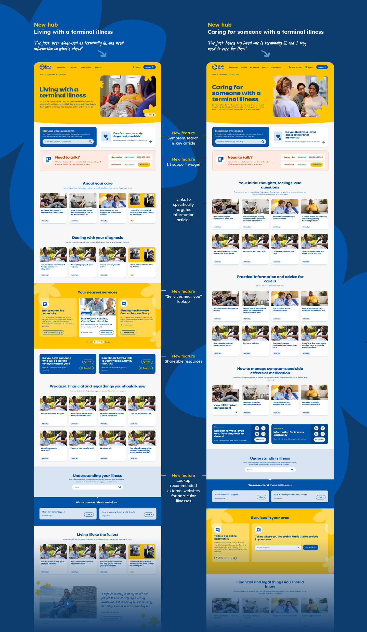
The website as it stood was a vast resource of information. However, due to the way it was organised, there was no way for users to find the information they need in a tailored way. Over a long period of time, the IA and information scent across the site had become difficult to explore and navigate.
As well as a refined IA spanning the whole site, we built new hubs for each user type to enable them to find the content they need, and return to as they progressed on their journey with terminal illness.
See below for visuals of each of our new tools:
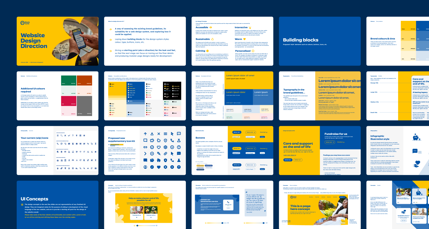
As with many rebrands, the new Marie Curie brand guidelines looked fresh and bold, yet needed to be adjusted to suit digital usage.
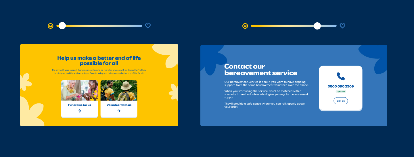
To make their brand suitable for their purposes, I put emotion and accessibility at the heart of the visual design. Key to this was adjusting the tone of the visuals and UI to suit a particular audience or step in the journey.
For example, the tone of design should be very different between a joyful, motivational fundraising module, and a contact module for a person who's just lost their loved one.

