The guys at Mohunky - a digital agency that makes Umbraco websites and web apps - were concerned that their website and overall brand was scaring away the very type of client they were aiming for... small and medium-sized businesses looking to scale up and upgrade from their wordpress website to something more secure, reliable and scalable.
The first stage was a brand strategy exercise. As part of this, I analysed their direct competitors - both locally, and from an SEO perspective - and also looked at comparators - those companies who were already successfully targeting a similar audience.
In comparing this to what Mohunky were doing currently, and where they wanted to be, I was able to write a mission statement and positioning for Mohunky that would let them stand out from the competition, and an aim for the brand should be positioned to talk to SMEs.


Rob, the founder of Mohunky, had designed the original logo and wanted to keep some of the spirit of it in the new version.
The core of the Mohunky brand was to represent the quirk and creativity of Mohunky that sets them apart from other web development agencies, which was behind the original 'splat' logo.
After some sketching, and a few digitised ideas, we settled on our new logo. You can see the process and results below.
The output was multiple colour versions of the full logomark, and super small versions of the logo to be displayed in small spaces (crucial when designing a logo that will be used in digital contexts), and finally a fun 'stamp' version that could be used on clothing.


A brand isn't just a logo - a combination of lots of design elements are what make the brand as a whole. I developed the brand guidelines while simultaneously working on the website. This allowed me to test various brand elements in real contexts and ensure that the elements would be usable and useful in a digital setting.
Ultimately, the guidelines consisted of...
Logos & usage
Colours
Typography
Iconography
Illustration style
Brand elements & graphics
Slide/document examples

Finally, I was able to apply the new brand to a new website design.
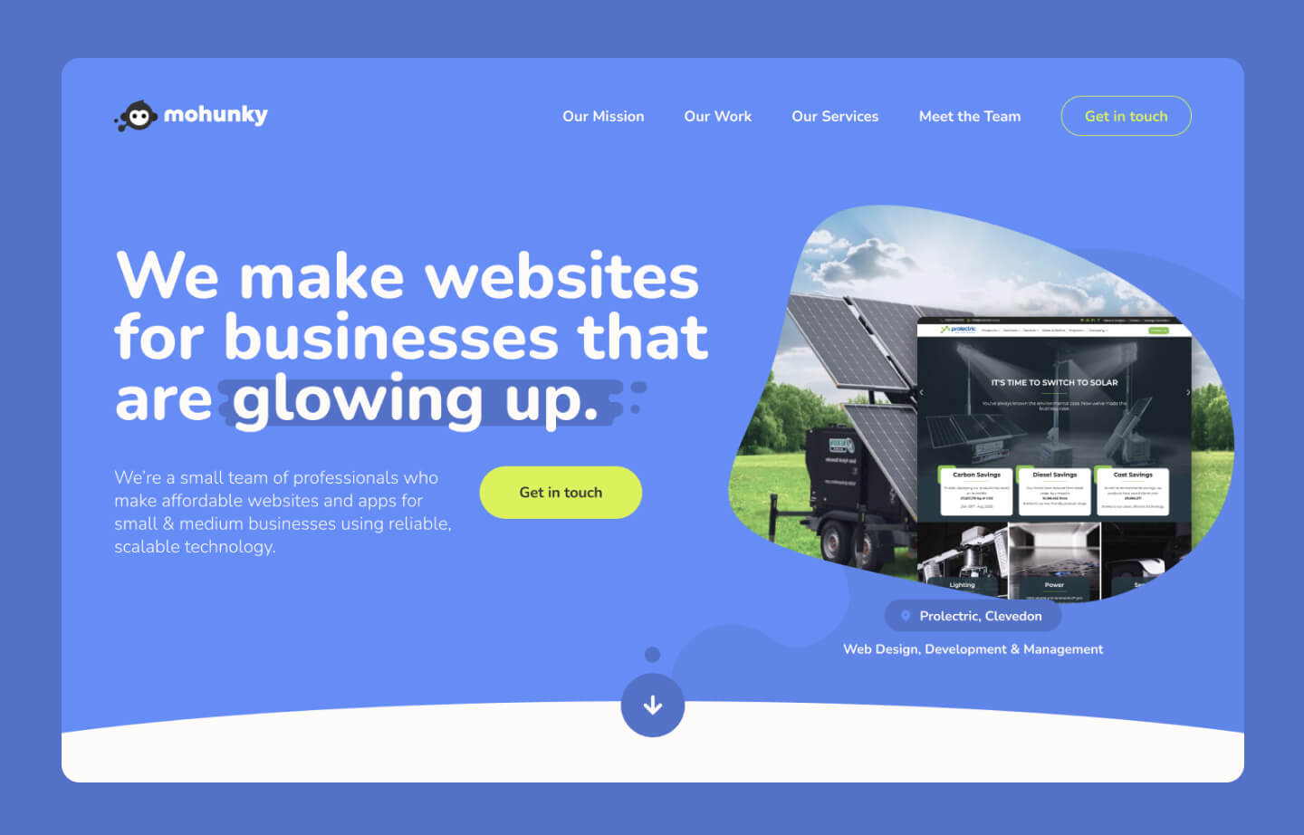
Initially focusing on the homepage, I took my strapline/copy ideas from the brand strategy and turned that into a hero area that summarised what Mohunky can do for growing SMEs, and showed real-life examples of this, using a clever play-on-words.
In the rest of the web design, I aimed to be as straight-talking and easy to understand as possible, while highlighting things that we believed to be most important to the audience type.
Overall I changed the focus from 'this is our method' to 'this is what we can deliver for you'. For example: "We are a collective agency" changed to "We make websites for growing businesses", and "small team of professionals".
Overall, we think this new website will be much more persuasive and less intimidating to small and medium businesses who need to upgrade their website or app to the next level.