


The engineering team built a fully-functioning survey platform in just a few weeks using an LLM/Tailwind for the frontend.
It needed a huge design tidy-up to make it acceptable, the UX was odd, and if you were a mobile user it was unusable — but the team launched it anyway.
After reaching ~800 users, I thought it was time to start refining the tool and the UI.
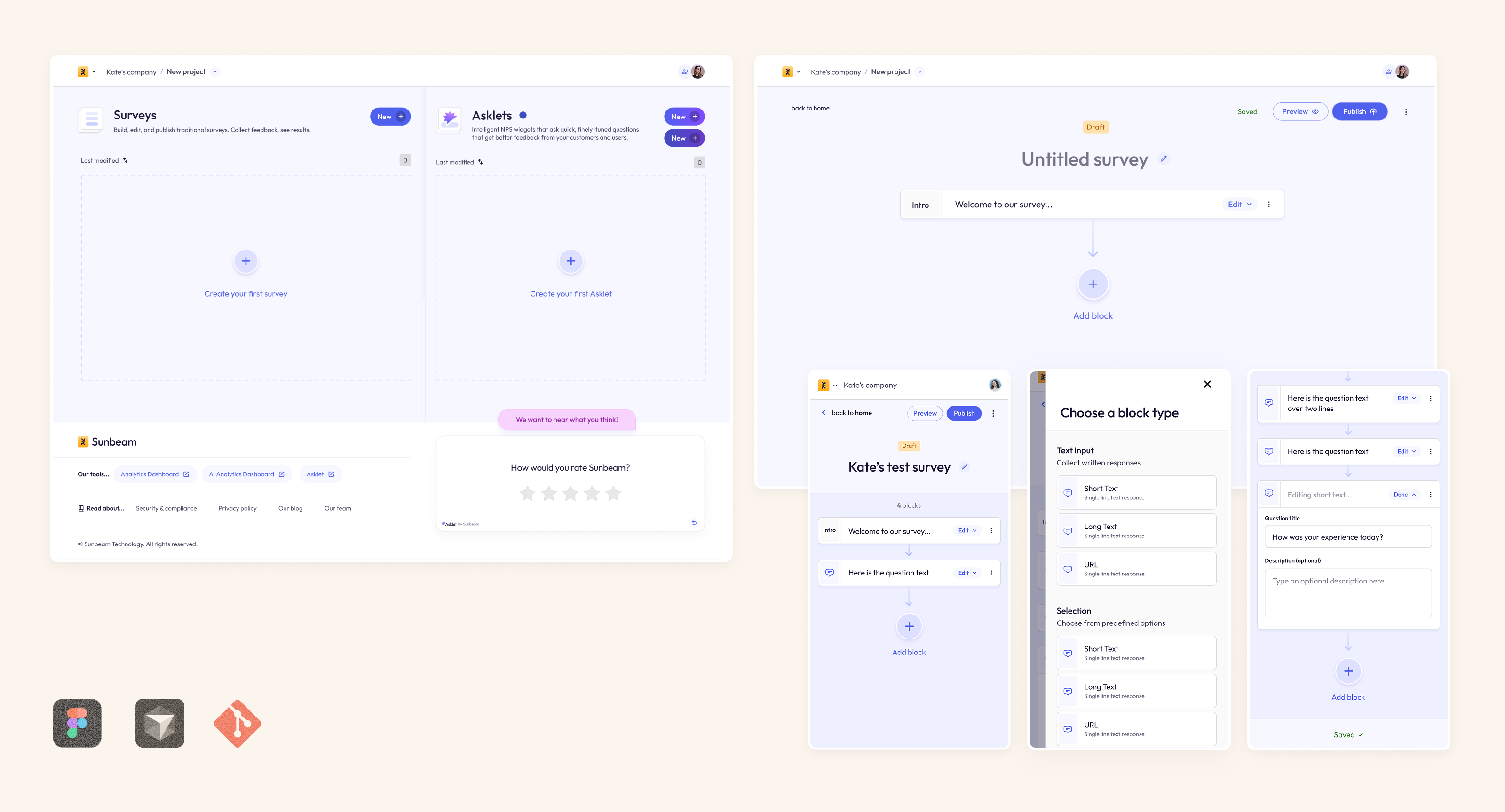
The builder was where we saw the most drop-offs. Less than half of users who started building a survey went on to complete and publish it. The LLM had built a split-screen experience, which (as seen on multiple screen recordings) was confusing and frustrating users.
You can see the old, clunky UI below:
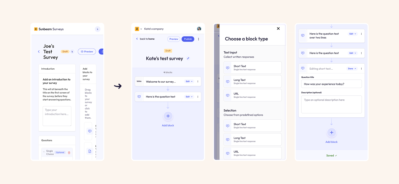
In just a couple of days, I had designed and launched a new survey builder UI which was mobile-first, tidier, much easier to use, and had some nice animations & interactions.
I set up analytics tracking to measure the rate of survey completion before and after. After 3 months of the new builder, the survey publish rate increased by 22%
The redesign of the dashboard:
- Increased the prominence of a tool we were promoting: Asklets (previously hidden far below the "fold".
- Listed surveys in rows, taking up much less space, and allowing users to sort by status, creation date, or number of responses
- Make the "Create new survey" buttons clearer to see
- Had new animations & interactions to make the product feel more polished and tactile
I'm currently upgrading the UI for the entire survey response view, in order to increase the survey completion rate.
It's early days, but in the first few days after my first batch of changes the completion rate has risen as high as 93%.
Once the changes are finished, I'll add them here.
Can't wait to see them? Drop me an email at kate@kateevans.design — I'd love to show you in person!


