


Sunbeam, a pre-seed startup, hired me as the sole Founding Designer in 2024.
They were looking to transform their basic prototype (powered by new AI technology and processes) into a fully-functioning, professional data analytics platform that was easy-to-use for their HR market.
Working with the ex-Head of Machine Learning @ Peakon, a small team of engineers, and a handful of design partners/clients, I built an innovative Experience Management platform and product suite that solved the problem of collecting, analysing, and tracking employee feedback at scale.
Toward the end of our journey, I also led the push into a new CX market, which led to us gaining 3,000 active users, and deals with 5 enterprise-level businesses.
In total we built the analytics platform, a survey platform, and an innovative new survey tool called Asklet, which uses AI to respond dynamically to respondents.
Sunbeam was a brand new business. They had no active userbase to talk to and no analytics to monitor. My time was also limited to just 8 weeks.
However, they did have a basic MVP and a number of sales calls and demos planned with their target market.
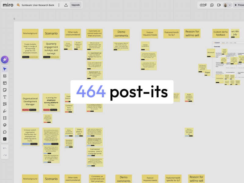
I sat in on more than 30 product demos and sales calls to get first-hand information about the challenges they faced, and what they would be looking for in such a tool, which helped me to immerse myself in the mindset of our target users.
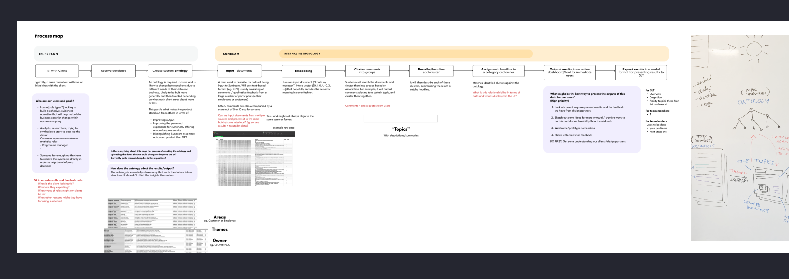
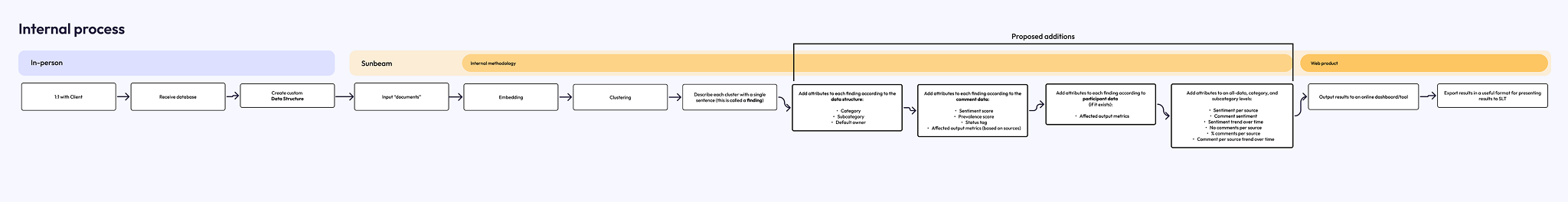
I needed to understand the product in its existing state, how it worked behind the scenes, and what made it unique. I conducted team workshops and discussions in order to map the full process in laymans terms and document a shared understanding.
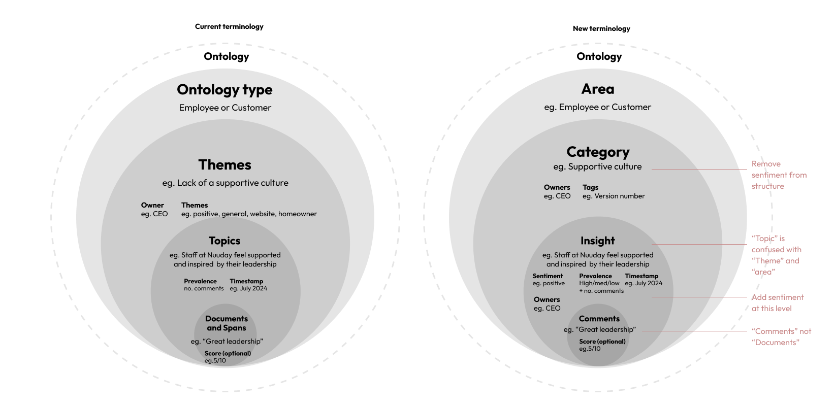
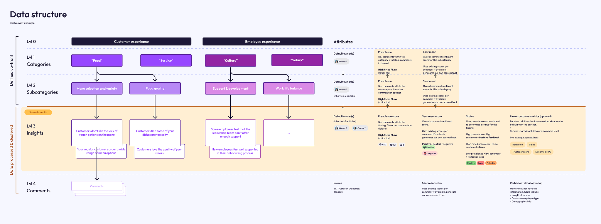
At this early stage in development, there were some parts of the product that were manual, and some that were powered by AI processes and automation.The manual parts were the creation of an ontology, which powered the categorisation of the analysis.
The automated (and clever) parts of the process were in the way the product handled an analysis of qualitative, text-based comments. It would use AI to cluster similar comments (and spans/parts of comments) together, and describe that cluster in one sentence, calling it a "Topic". This would then be output to a simple dashboard as a way to browse the findings.
When we compared this to the existing tools in this space, it was revolutionary. All these tools relied on simple scoring metrics and surface-level keyword count or wordcloud for their analysis, and would need an overhall of their entire platform to incorporate a method of tracking feedback using this richer, more insightful method.
"1000 people mentioned salary" is unhelpful, and tells you nothing.
But with Sunbeam, this becomes:
"880 employees feel that the salary model is unfair", which is infinitely more insightful.
The current process, being an MVP, yielded basic and somewhat inconsistent results, but the core value and potential was evident.


Mindful of our limited time, I created some light-touch personas that the team could evolve as we learned more.
In these, I listed a number of 'Hypothesis to test' against each persona that the team and I would be able to validate or rule out in further conversations.
The primary persona aand target market for the business was our HR/People Analytics user.
They wanted a more efficient way to analyse the qualitative data in their employee feedback surveys, as they were wasting days and days manually reading through comments. This problem escalated for global companies with hundreds of thousands of employees.
These users were, often, not considered tech-savvy, and so would prefer an experience that is friendly, unintimidating, and that does all the work of interpreting the analysis for them where possible.
The founder had already built a rough MVP that they were demo-ing to potential customers. Based on the knowledge gained from my research, and from my understanding of the technology, I started to make some notes against screenshots of the UI, that I could take to the owners to discuss. The notes covered inconsistencies, some immediate easy fixes, ideas for larger pieces of work, and questions to take to the team.

I wanted to start making improvements to what we demo to potential clients, in that I could utilise their feedback to shape the product into something more desirable.
To do this, we didn't need to immediately build it — we just needed something to demo.
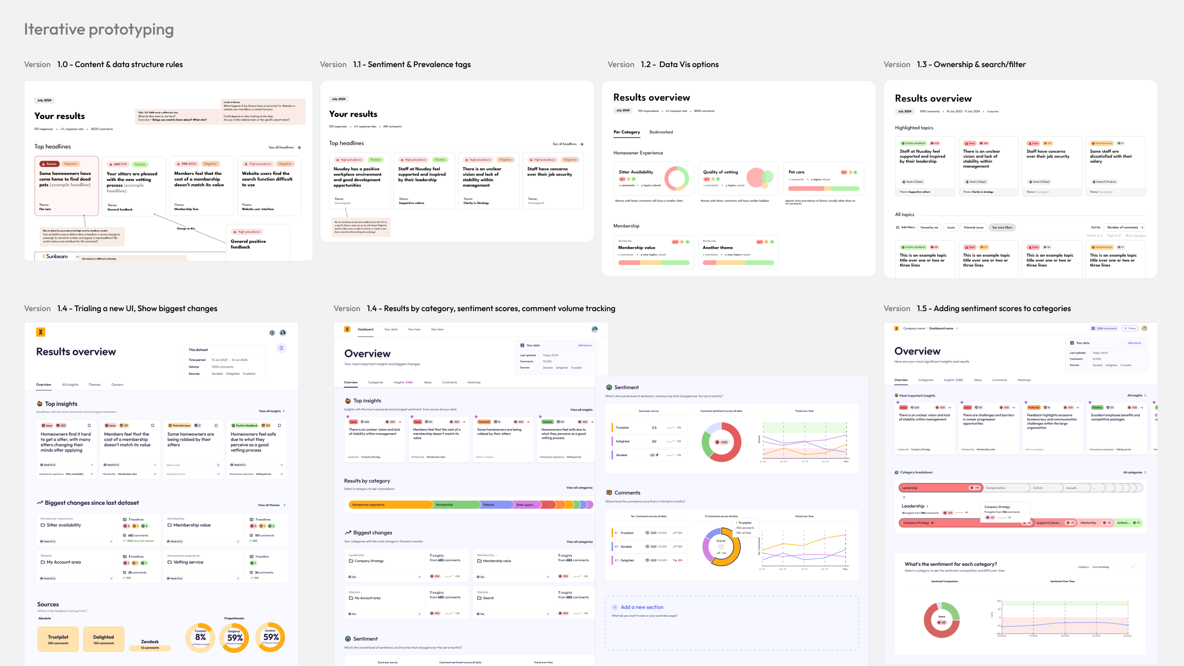
Over the course of a few weeks, I made 6 iterations of the prototype under the continued guidance of 2 of our design partners, and based on feedback from further sales demos.
You can see from the initial images, the prototypes were extremely basic. The first few acted as a conversation starter, and each subsequent version made only a few changes to the original each time.
I worked quickly, only taking a few weeks. By the end of this process we had signed a new client, and had continued discussions with many others.
You can also see that I spent some time refining a UI style. The feedback was overwhelmingly in favour of a light-mode, friendly and approachable direction, using colour sparingly to denote things like status or sentiment, so that was the direction I took.
The way everything was named and labelled in the UI was, naturally, developer-coded. The quotes from employee surveys were called "documents" which was often confused for the documents being uploaded. Parts of those quotes were called "spans". The categories of findings made by the ontology (taxonomy) were called "themes" while the clusters of findings were called "topics". Themes and topics were also constantly swapped and confused.
To make the language more user-friendly and consistent, I advocated for a change:
Documents became comments;
Themes became Categories and Subcategories
Topics became Insights
Aspects became Tags
This helped all of us, including our users, to have a shared understanding of the system from the start, and ensured no crossed-wires.
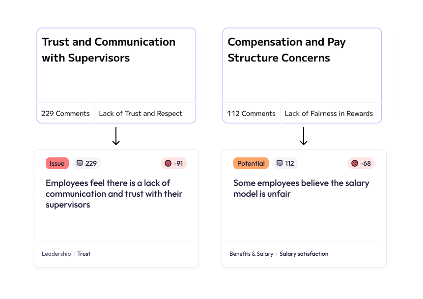
The original prototype had some inconsistencies in the way it described its insights, and the category it belonged to.
For example, the insight would be "Trust and communication with supervisors", under the category "Lack of Trust".
Ideally, the insight would be more specific and delivered in a more natural-sounding way, and the category would be neutral, allowing a broad spectrum of insights beneath it.
With the new changes:
"Trust and communication with supervisors"
became
"There is a lack of trust and communication with supervisors"
The category "Lack of Trust" became "Trust"
...and so on.
This allowed a broad spectrum of both positive, negative or neutral insights to be surfaced under each category, which also unlocked the possibility of tracking a categories sentiment change over time... more on that later.
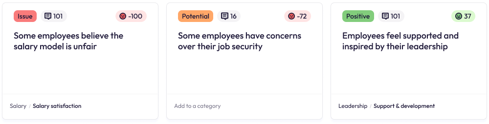
In short, I wanted to show how ‘talked about’ something is. We did this by creating a score that could be applied at an Insight, category and subcategory level.
For ease, the score was summarised as High, Medium, or Low prevalence.

As time progressed, prevalence was instead shown implicitly through surfacing the insight on the dashboard. It became visually set-back in order to keep the UI focused.
Our founder and ML expert also created a way to score each comment with a sentiment score. The scores of all comments clustered within an insight would then build to an overall sentiment score between -100 and +100, which we could display on an insight to demonstrate severity.

One of the main things raised by our potential clients and users was the ability to easily see which insights were urgent issues, which were on their way to becoming issues, and which were actually positive feedback.
Internally there was some uncertainty about whether we should show positive insights at all, as they "were less interesting". However after some discussions with design partners, it was clear that positive insights were equally important for making decisions based on data.
Using a combined prevalence and sentiment score, we set boundaries for what was considered an "issue", what was just a "potential issue" and what was positive, and added UI that flagged this visually to the user.
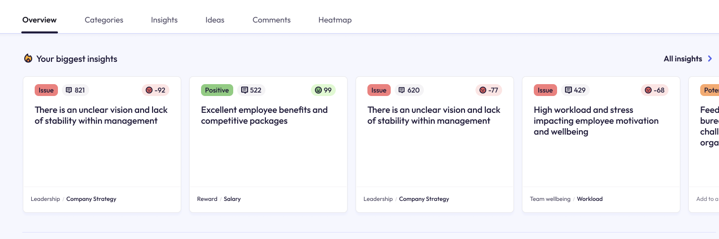
Our users not only wanted to see specific insights, but how areas of their business were performing at a high level.
I defined a new way of processing and structuring the data so that:
You could track prevalence and sentiment across categories. For example, "Work Culture" could be rated "Highly prevalent" (mentioned a lot in comments) and has an overall very positive sentiment.
You could also break that down into sub-categories. For example, "Work Culture" has a positive sentiment, but "Culture / Work Life Balance" is unusually negative, showing that there is a problem there.
The way it would work was: an individual comment (or part of a comment), would be assigned a sentiment score, if one wasn't already provided as part of the data. If that comment was categorised, then all the comments within that category would have their sentiment scores summed up and averaged into an overall sentiment score for that category. I worked with our founder, a PhD Statistician, to ensure the method yielded statistically accurate results.
For prevalence, we would use a process of counting the comments (or spans) for that category/subcategory and interpret prevalence as a proportion of overall comments.
Now that we could split the results into categories and subcategories, we needed an easy way to navigate them, which was also a visual way of illustrating which were most prevalent.
Our UI at the time was getting almost no interaction, and users rarely scrolled through the list of categories. I wanted to increase user interaction and engagement with the categories.
Our first design was something we called "the bubbles":
It recieved nice feedback, but in the end it was too big and unnecessarily complex, especially in cases where there were more categories.
We settled on a different design, which we called "the bars".
The bars showed categories and subcategories, where bar width illustrated how often the category was discussed. I also, eventually, added colour-coding to the bars to show the level of sentiment for that category.
Selecting a category would open its subcategories.
This allowed users of the platform to immediately see:
- What are people most talking about?
- Where are the areas of concern, and what areas are positive?
- What areas are having the biggest impact on satisfaction?
The new design became the most used UI component in the platform, and the level of engagement increased exponentially.
(Note: the following prototypes use dummy HR survey data)
The attitudes to AI technology were changing week-on-week, and there was a growing sense of distrust in its capabilities due to the (at the time) lack of understanding of how it worked.
A tool that simply "ran an analysis" without any form of showing links to sources or working would not be recieved well by our market.
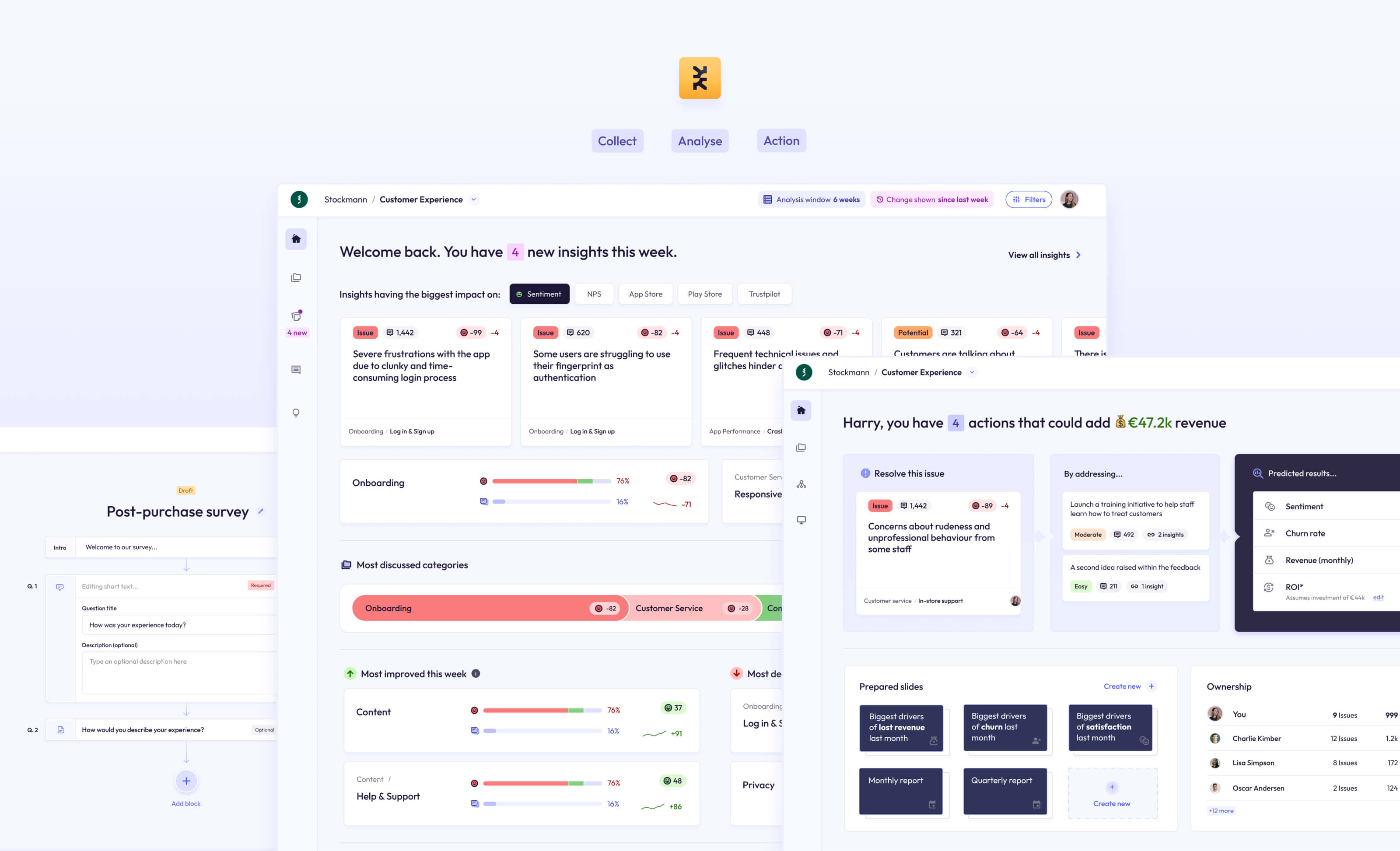
With that in mind, I designed a new Insight Details page that showed:
- The number of comments that built towards the insight
- The exact sentiment score
- A detailed summary
- A list of each individual comment, tagged with the original source and other information
- A breakdown of how prevalent this insight was as a proportion of the overall dataset
- A breakdown of the data by tag
Another important feature I wanted to add was the ability for users to remove or move a comment from the insight themselves.
This level of transparency and non-destructive working led to greater trust in the product and a greater amount of positive interest during sales calls.
I'm still working on getting the next phase of this case study live. It was a big project!
If you can't wait, drop me an email at kate@kateevans.design, I'd love to show you in person.
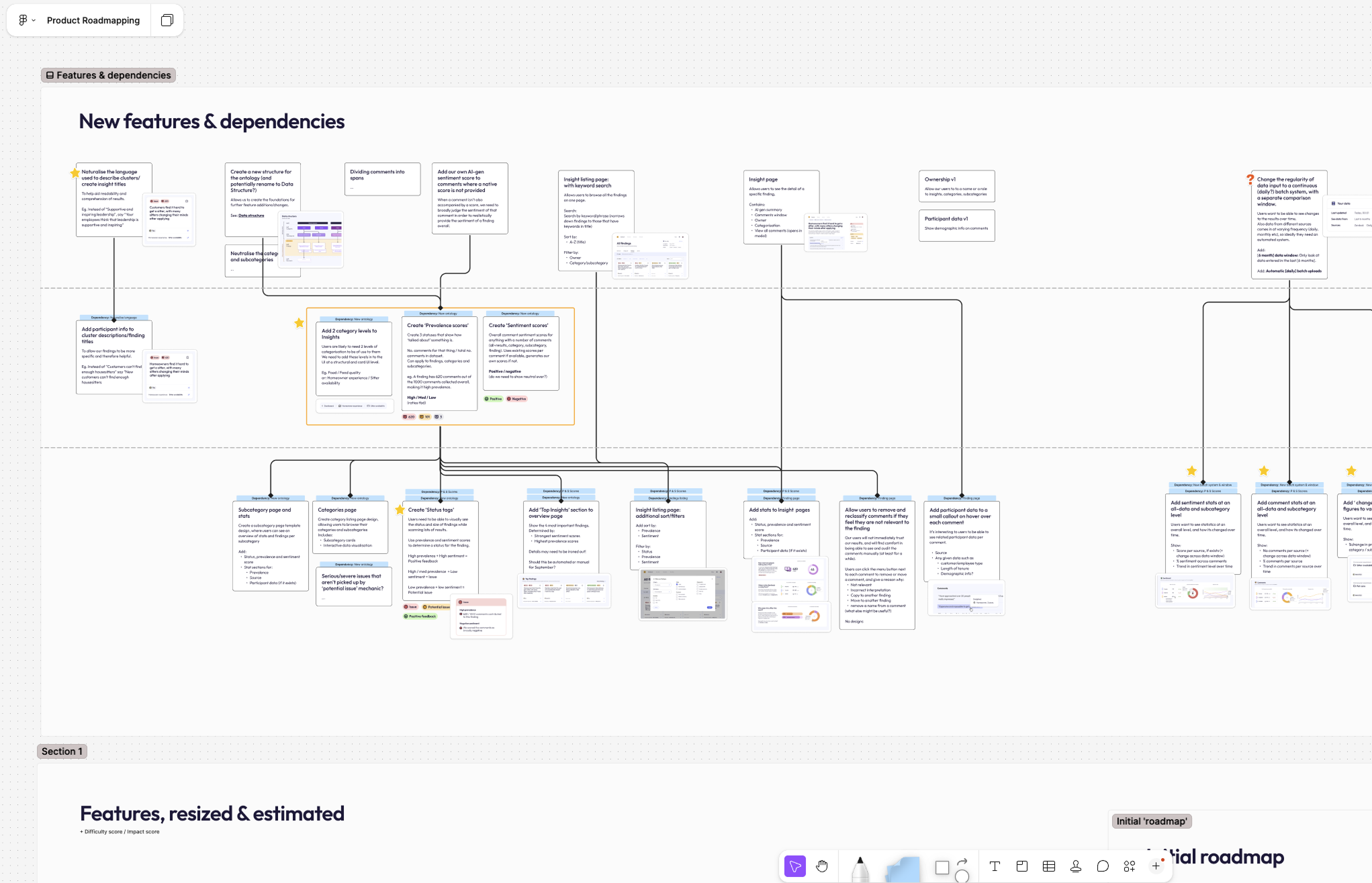
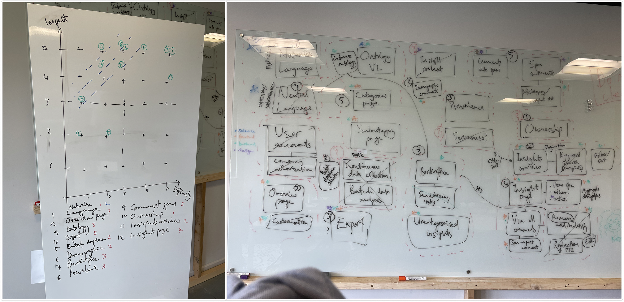
At the end of this prototyping stage, we came together as a team to further discuss all the new features, and measure them for Impact vs Effort.
My product roadmap took this into account, as well as technical dependencies.
To summarise, we now had a working list of features to work on:
- Now (before September)
- Next (next year)
- Future

